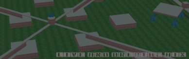
a little gimp pic
-
ducktape
- Private First Class

- Posts: 1206
- Joined: Sat Jul 01, 2006 2:06 am
- Location: Right Behind you!
a little gimp pic
Hi all this is my newest pic made with gimp. any suggestions would be greatly used. it was made for my site i'm making: http://ducktapedyndns.jimdo.com/
- Attachments
-
- ducktape.jpg (23.01 KiB) Viewed 3365 times

Looks aight, colours are good.
But I don't particuarly like the letters, im sure there's another font that's similar, and easier to read.
Also the blending between colours is a bit rough, perhaps you could work on that.
Yea, pretty good ducktape
But I don't particuarly like the letters, im sure there's another font that's similar, and easier to read.
Also the blending between colours is a bit rough, perhaps you could work on that.
Yea, pretty good ducktape
Last edited by Grace F on Sat Apr 28, 2007 12:50 am, edited 1 time in total.


i dont think the letters are THAT hard to read. pretty good ducktape!Grace F wrote:Looks aight, colours are good.
But I don't particuarly like the letters, im sure there's another font that's similar, and easier to read.
Also the blending between colours is a bit rough, perhaps you could work on that.
Yea, pretty good ducktape

Now, an army is a team - it lives, eats, sleeps, fights as a team. This individuality stuff is a bunch of crap. - Patton

bleh, bleh, bleh.
Ducktape: I very much like your first attempt. I think the font is perfectly readable. The coloration would work better if you moved the gradient to the left a little; i.e. the 'b' wouldn't be as dark.
Well done.
Well done.
-
The Frog Master

- Private First Class
- Posts: 59
- Joined: Tue Jan 02, 2007 5:29 am
- Location: Somewhere in the vicinity of betelgeuse
-
Delta_Force

- Private First Class
- Posts: 12
- Joined: Fri Feb 16, 2007 4:51 pm
- Location: Delta Force, Kingswood (Paintballing Arena)